Challenge
The The team behind the Statewide Wellness webinar series was looking to transition from their traditional yearly Word document flyer to a more timely and visually engaging method of promoting quarterly wellness courses.
The The team behind the Statewide Wellness webinar series was looking to transition from their traditional yearly Word document flyer to a more timely and visually engaging method of promoting quarterly wellness courses.
Solution
Project Roles:
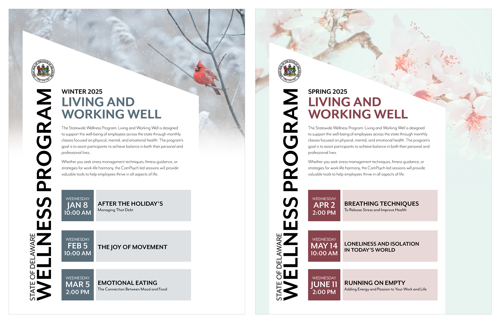
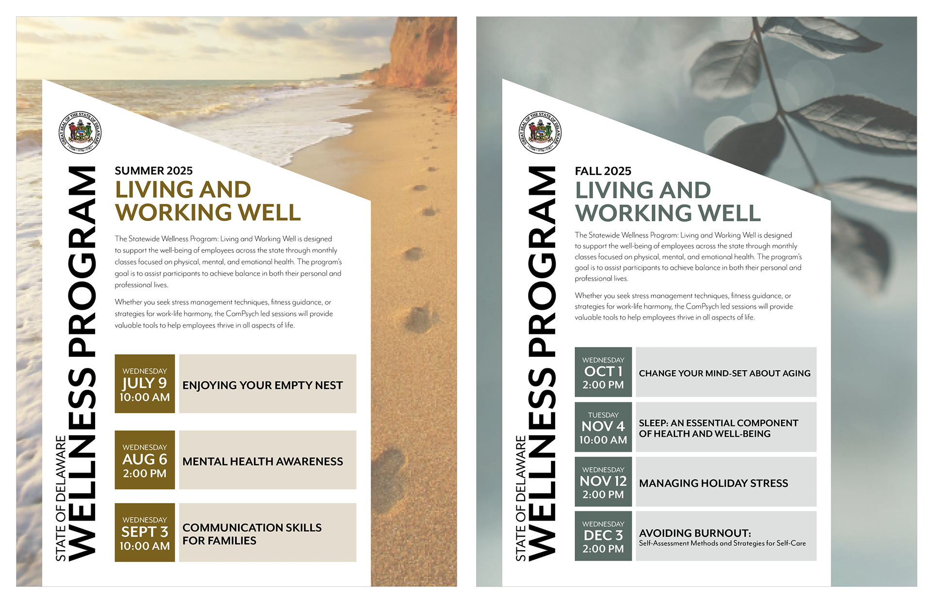
The final design broke the wellness webinar series information up into four seasonal flyers, making the information easier to digest and far less overwhelming. This approach also allowed the team to send flyers out once per quarter, keeping them timely and preventing important details from getting buried in crowded inboxes. My goal was to create something that not only conveyed information clearly but also built instant brand recognition and stayed visually fresh throughout the year. To achieve this, I placed the wellness program’s name and state seal prominently on every flyer, ensuring an immediate connection with viewers. By keeping the layout consistent across all seasons, I aimed to foster familiarity and encourage ongoing engagement.
Each flyer’s imagery reflects its season’s unique feel. Winter’s snowy backdrop and striking red cardinal convey stillness while catching the eye. Spring’s soft cherry blossoms suggest renewal and growth. Summer’s inviting, almost magical beach scene radiates warmth and relaxation, while fall’s rich green tones capture the last hints of lushness before the seasonal shift. The event details are laid out in a simple, structured format, with dates and topics neatly organized in defined boxes. This clear, consistent structure makes it easy for viewers to absorb the information at a glance.
Art Direction / Designer
Software Used:
Adobe Creative Cloud (Illustrator, InDesign, Photoshop)